
Click on the image for a better view
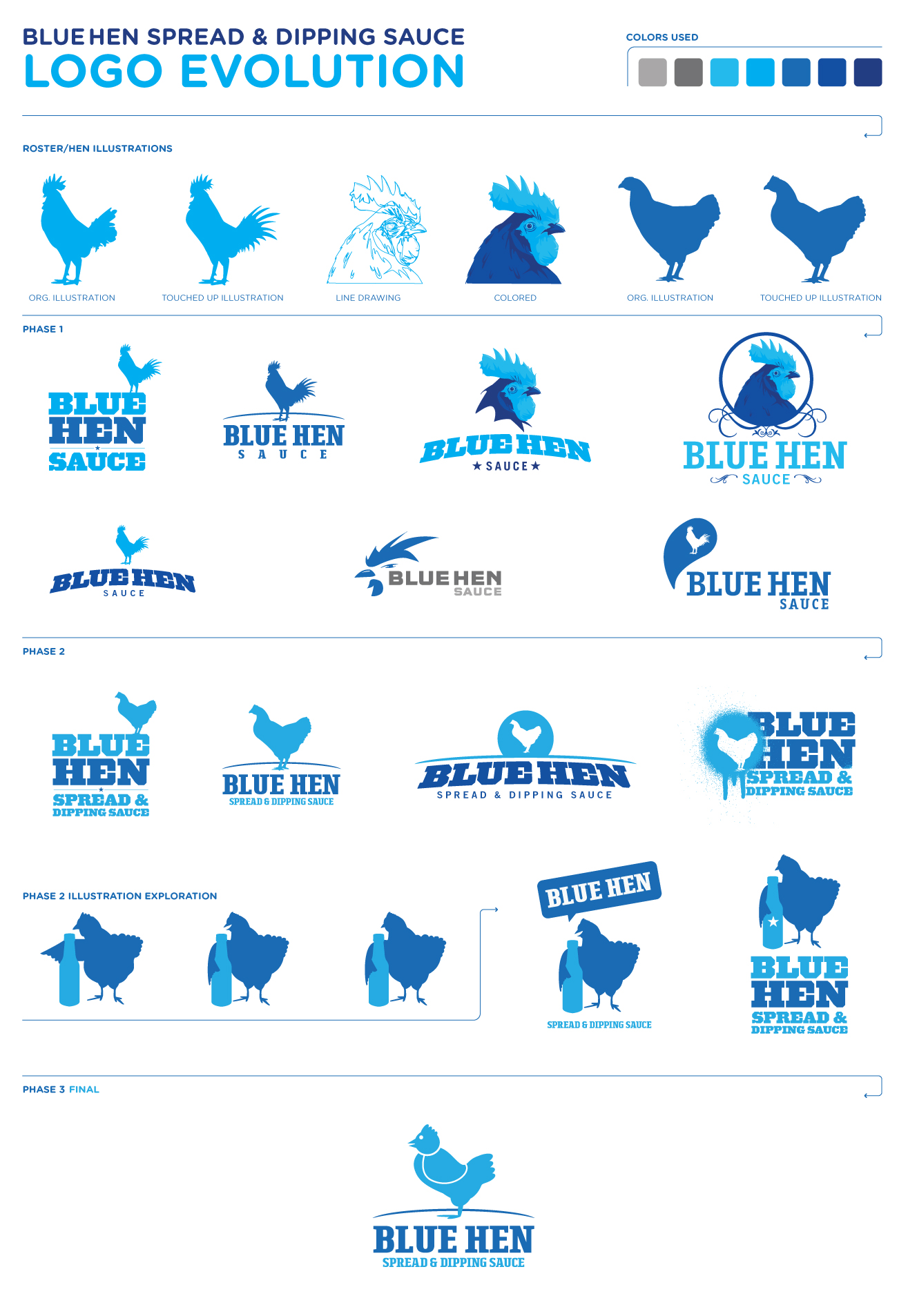
Few weeks ago I was put on a logo for Blue Hen sauce. This illustrates the process and work put into a logo design. It also didn't help that the client didn't know exactly what he wanted and apparently how much a designer puts into a logo, including research. A quick search shows that the blue hen is an actually term for a chicken yet not a recognized breed but dates back to the Revolutionary War and is also the state bird of Delaware. The blue hen resembles a roster. So imagine were my stating point would be? A roster look? Wow! Imagine that. Phase 1 was complete and sent for review. Only comments in return were it's a roster not a hen. Try again and make sure the artist really knows the difference between a roster and a hen. Huumm think a mention of that may help in the beginning? Nah, let's direct this blind person towards a wall and laugh when they run into it. Also added was, maybe make it comical. Phase 2 completed and sent. Bottle looks like liquor but here is an image I found that is exactly what I want. Really? How hard is that? Phase 3, bam! Done.Disclaimer: This was for a 3rd party client. The middle man is the one make these comments not the actually client.
No comments:
Post a Comment